Introduction
The veritable scikit-learn Python machine learning package has reached its 1.0 release after only 14 years of development, and included in the release is a new SplineTransformer class. I love splines, but they can be a bit confusing if you don’t understand what you’re looking at, so I thought I’d give a bit of background on how they work with some nice matplotlib plots in the process.
SplineTransformer
Let’s start with a quick demo of what SplineTransformer can do for you. We’ll start with a linear regression (once we have all our imports):
import re
import warnings
from contextlib import contextmanager
from functools import partial
from itertools import starmap
from operator import mul

import numpy as np
import pandas as pd
import matplotlib.pyplot as plt
import seaborn as sns
import scipy
import statsmodels.api as sm
import patsy

from palmerpenguins import load_penguins
from cycler import cycler
from sympy import Reals, diff, pi
from symfit import parameters, variables, Fit, Parameter, Piecewise, exp, Eq, Model

from sklearn.linear_model import LinearRegression
from sklearn.pipeline import Pipeline
from sklearn.preprocessing import SplineTransformer, PolynomialFeatures

plt.rcParams["figure.figsize"] = (16, 7)
Define some data and fit the pipeline, which is just a spline transformer followed by a linear regression:
np.random.seed(0)

x_data = np.linspace(0, 2 * np.pi, 30)
x_points = np.linspace(0, 2 * np.pi, 1000)
y_data = np.sin(x_data) + (0.25 * np.random.randn(x_data.shape[0]))

transformer = SplineTransformer()
pipeline = Pipeline([
    ('basis_expansion', transformer),
    ('linear_regression', LinearRegression(fit_intercept=False)),
])

pipeline.fit(x_data.reshape(-1, 1), y_data)
Pipeline(steps=[('basis_expansion', SplineTransformer()),
                ('linear_regression', LinearRegression(fit_intercept=False))])
Create a little context manager because we’re going to plotting this a lot:
scatter_colour, *colours = sns.color_palette("husl", 3)

@contextmanager
def plot_sine(n_colours=2, palette="husl"):
    fig, ax = plt.subplots()
    _, *colours = sns.color_palette(palette, 1 + n_colours)
    ax.set_prop_cycle(cycler(color=colours))
    yield ax
    ax.set_xticks([0, np.pi/2 , np.pi, 3 * np.pi/2, 2 * np.pi])
    ax.set_xticklabels([0, r"$\frac{π}{2}$", "π", r"$\frac{3π}{2}$", "$2π$"])
    if any(ax.get_legend_handles_labels()):
        ax.legend()
And plot the result:
with plot_sine() as ax:
    ax.scatter(x_data, y_data, color=scatter_colour, label="Data")
    ax.plot(x_points, np.sin(x_points), label="$\sin{x}$")
    ax.plot(x_points, pipeline.predict(x_points.reshape(-1, 1)), label="Spline Fit")
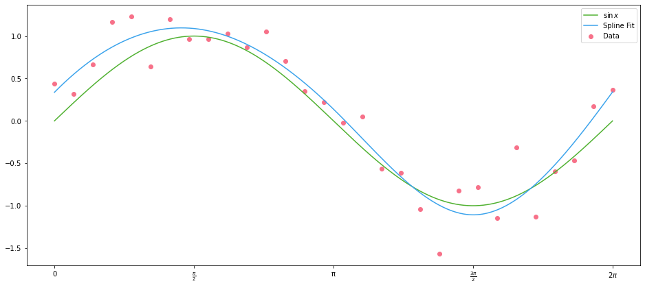
What on earth is happening here? We have a linear regression, with univariate $X$ data, which has resulted in a smooth fit of our $\sin{x}$ data.
Let’s pass our $X$ data to the transformer and see what happens when we plot the result:
transformed = transformer.transform(x_points.reshape(-1, 1))

with plot_sine(n_colours=7, palette="Blues") as ax:
    for i, data in enumerate(iter(transformed.T), 1):
        ax.plot(x_points, data, label=f"Spline {i}")
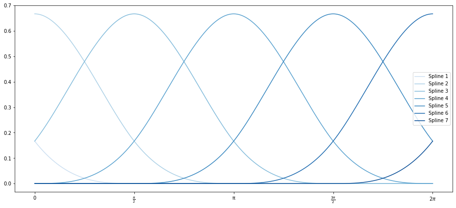
And look at a DataFrame of the different splines’ values for our input values of $x$:
df = pd.DataFrame(
    data=transformed,
    columns=(f"Spline {i}" for i in range(1, 8)),
    index=pd.Index(x_points.round(3), name="$x$")
)

df.iloc[::50].round(3)
| $x$ | Spline 1 | Spline 2 | Spline 3 | Spline 4 | Spline 5 | Spline 6 | Spline 7 |
|---|---|---|---|---|---|---|---|
| 0.000 | 0.167 | 0.667 | 0.167 | 0.000 | 0.000 | 0.000 | 0.000 |
| 0.314 | 0.085 | 0.631 | 0.283 | 0.001 | 0.000 | 0.000 | 0.000 |
| 0.629 | 0.036 | 0.538 | 0.415 | 0.011 | 0.000 | 0.000 | 0.000 |
| 0.943 | 0.011 | 0.414 | 0.539 | 0.036 | 0.000 | 0.000 | 0.000 |
| 1.258 | 0.001 | 0.282 | 0.631 | 0.086 | 0.000 | 0.000 | 0.000 |
| 1.572 | 0.000 | 0.166 | 0.667 | 0.167 | 0.000 | 0.000 | 0.000 |
| 1.887 | 0.000 | 0.085 | 0.630 | 0.283 | 0.001 | 0.000 | 0.000 |
| 2.201 | 0.000 | 0.036 | 0.538 | 0.416 | 0.011 | 0.000 | 0.000 |
| 2.516 | 0.000 | 0.011 | 0.414 | 0.540 | 0.036 | 0.000 | 0.000 |
| 2.830 | 0.000 | 0.001 | 0.282 | 0.631 | 0.086 | 0.000 | 0.000 |
| 3.145 | 0.000 | 0.000 | 0.166 | 0.667 | 0.168 | 0.000 | 0.000 |
| 3.459 | 0.000 | 0.000 | 0.085 | 0.630 | 0.284 | 0.001 | 0.000 |
| 3.774 | 0.000 | 0.000 | 0.036 | 0.537 | 0.416 | 0.011 | 0.000 |
| 4.088 | 0.000 | 0.000 | 0.010 | 0.413 | 0.540 | 0.036 | 0.000 |
| 4.403 | 0.000 | 0.000 | 0.001 | 0.281 | 0.632 | 0.086 | 0.000 |
| 4.717 | 0.000 | 0.000 | 0.000 | 0.165 | 0.667 | 0.168 | 0.000 |
| 5.032 | 0.000 | 0.000 | 0.000 | 0.084 | 0.630 | 0.285 | 0.001 |
| 5.346 | 0.000 | 0.000 | 0.000 | 0.035 | 0.537 | 0.417 | 0.011 |
| 5.661 | 0.000 | 0.000 | 0.000 | 0.010 | 0.412 | 0.541 | 0.037 |
| 5.975 | 0.000 | 0.000 | 0.000 | 0.001 | 0.280 | 0.632 | 0.087 |
So SplineTransformer has split out our $x$ data into seven different features which are zero for much of the range, but whose values overlap with each other. Those get fed into a (now multivariate) OLS model for fitting.
Basis Functions
Let’s plot our data again, so we don’t have to remember what it looks like:
with plot_sine() as ax:
    ax.scatter(x_data, y_data, color=scatter_colour, label="Data")
    ax.plot(x_points, np.sin(x_points), label="$\sin{x}$")
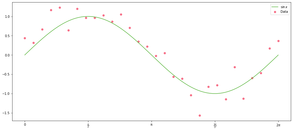
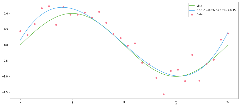
It looks not unlike a cubic polynomial with roots at $0$, $\pi$ and $2\pi$:
\[(x - 2\pi)(x - \pi)(x) = x^3 - 3\pi x^2 + 2\pi^2 x\]Let’s define a cubic function and add it to the plot above:
def cubic(x, a, b, c, d):
    return (a * x ** 3) + (b * x ** 2) + (c * x) + d
with plot_sine() as ax:
    ax.scatter(x_data, y_data, color=scatter_colour, label="Data")
    ax.plot(x_points, np.sin(x_points), label="$\sin{x}$")
    ax.plot(
        x_points,
        cubic(x_points, 1/10, -3 * np.pi/10, 2 * (np.pi ** 2) / 10, 0),
        label=r"$(x^3 - 3\pi x^2 + 2\pi^2 x)/ 10$"
    )
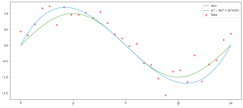
The values of the coefficients for the polynomials here were chosen based on the roots, then scaled to fit by eye. We can do better than this of course–we can minimize the Euclidean distance between the polynomial and our data using scipy:
def euclidean_distance(args):
    return np.linalg.norm(cubic(x_data, *args) - y_data)
result = scipy.optimize.minimize(euclidean_distance, np.zeros(4))
result
      fun: 1.4141563570532016
 hess_inv: array([[ 0.00198243, -0.01855423,  0.04546989, -0.02129126],
       [-0.01855423,  0.17872344, -0.45697212,  0.23049655],
       [ 0.04546989, -0.45697212,  1.25232704, -0.72744725],
       [-0.02129126,  0.23049655, -0.72744725,  0.60954303]])
      jac: array([-4.78047132e-03, -1.08745694e-03, -2.49281526e-04, -7.38352537e-05])
  message: 'Desired error not necessarily achieved due to precision loss.'
     nfev: 256
      nit: 12
     njev: 49
   status: 2
  success: False
        x: array([ 0.09698863, -0.88818303,  1.79131703,  0.15075022])
And plot the resulting polynomial. Note that here we are fitted on the data with normal errors, not the underlying sine curve:
with plot_sine() as ax:
    label = "${:.02f}x^3 {:+.02f}x^2 {:+.02f}x {:+.02f}$".format(*result.x)
    ax.scatter(x_data, y_data, color=scatter_colour, label="Data")
    ax.plot(x_points, np.sin(x_points), label="$\sin{x}$")
    ax.plot(x_points, cubic(x_points, *result.x), label=label)
What is it that we have done here? We have defined a new columns, whose values are $1$, $x$, $x^2$ and $x^3$. In the parlance of machine learning, we’ve engineered new features from our original features. This defines a set basis functions of our original data; and applying these functions to our $x$ data gives us a basis expansion. Here, basis has the same meaning as in linear algebra, where we have a basis of a vector field; here we have linearly independent functions that form a basis of the function space of quadratic polynomials.
Let’s repeat this fitting approach in the standard OLS way: create the features and fit a model. First, create our new feature array (aka design matrix):
X = np.c_[np.ones(len(x_data)), x_data, x_data**2, x_data**3]
X[:5]
array([[1.        , 0.        , 0.        , 0.        ],
       [1.        , 0.21666156, 0.04694223, 0.01017058],
       [1.        , 0.43332312, 0.18776893, 0.08136462],
       [1.        , 0.64998469, 0.42248009, 0.27460559],
       [1.        , 0.86664625, 0.75107572, 0.65091696]])
Next, fit the OLS model and look at the results:
res = sm.OLS(y_data, X).fit()
res.summary()
| Dep. Variable: | y | R-squared: | 0.897 |
|---|---|---|---|
| Model: | OLS | Adj. R-squared: | 0.885 |
| Method: | Least Squares | F-statistic: | 75.69 |
| Date: | Thu, 17 Mar 2022 | Prob (F-statistic): | 5.65e-13 |
| Time: | 12:25:27 | Log-Likelihood: | -1.9462 |
| No. Observations: | 30 | AIC: | 11.89 |
| Df Residuals: | 26 | BIC: | 17.50 |
| Df Model: | 3 | ||
| Covariance Type: | nonrobust |
| coef | std err | t | P>|t| | [0.025 | 0.975] | |
|---|---|---|---|---|---|---|
| const | 0.1507 | 0.180 | 0.839 | 0.409 | -0.219 | 0.520 |
| x1 | 1.7913 | 0.252 | 7.112 | 0.000 | 1.274 | 2.309 |
| x2 | -0.8882 | 0.094 | -9.442 | 0.000 | -1.082 | -0.695 |
| x3 | 0.0970 | 0.010 | 9.863 | 0.000 | 0.077 | 0.117 |
| Omnibus: | 3.057 | Durbin-Watson: | 2.210 |
|---|---|---|---|
| Prob(Omnibus): | 0.217 | Jarque-Bera (JB): | 1.662 |
| Skew: | -0.417 | Prob(JB): | 0.436 |
| Kurtosis: | 3.797 | Cond. No. | 609. |
Note that the coefficients of the data are exactly the coefficients of the cubic polynomial that minimised our Euclidean distance–because that’s exactly what OLS does:
result.x[::-1]
array([ 0.15075022, 1.79131703, -0.88818303, 0.09698863])
As an aside, in statsmodels we don’t need to create our design matrix manually, we can define it in a patsy formula if we pass the data as a DataFrame:
df = pd.DataFrame(dict(x=x_data, y=y_data))
sm.OLS.from_formula("y ~ 1 + x + np.power(x, 2) + np.power(x, 3)", df).fit().summary()
| Dep. Variable: | y | R-squared: | 0.897 |
|---|---|---|---|
| Model: | OLS | Adj. R-squared: | 0.885 |
| Method: | Least Squares | F-statistic: | 75.69 |
| Date: | Thu, 17 Mar 2022 | Prob (F-statistic): | 5.65e-13 |
| Time: | 12:25:27 | Log-Likelihood: | -1.9462 |
| No. Observations: | 30 | AIC: | 11.89 |
| Df Residuals: | 26 | BIC: | 17.50 |
| Df Model: | 3 | ||
| Covariance Type: | nonrobust |
| coef | std err | t | P>|t| | [0.025 | 0.975] | |
|---|---|---|---|---|---|---|
| Intercept | 0.1507 | 0.180 | 0.839 | 0.409 | -0.219 | 0.520 |
| x | 1.7913 | 0.252 | 7.112 | 0.000 | 1.274 | 2.309 |
| np.power(x, 2) | -0.8882 | 0.094 | -9.442 | 0.000 | -1.082 | -0.695 |
| np.power(x, 3) | 0.0970 | 0.010 | 9.863 | 0.000 | 0.077 | 0.117 |
| Omnibus: | 3.057 | Durbin-Watson: | 2.210 |
|---|---|---|---|
| Prob(Omnibus): | 0.217 | Jarque-Bera (JB): | 1.662 |
| Skew: | -0.417 | Prob(JB): | 0.436 |
| Kurtosis: | 3.797 | Cond. No. | 609. |
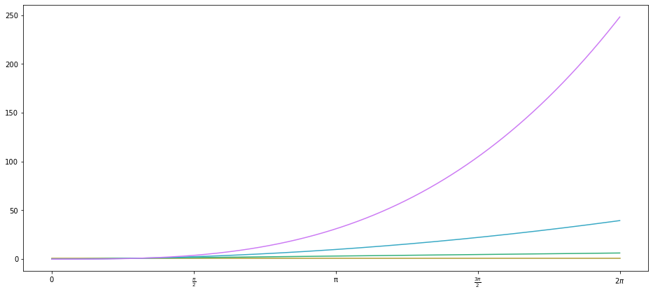
This is a bit clearer because the column names are named more helpful in the fitted model summary, but otherwise, the results are identical. As it happens, scikit-learn already has a PolynomialFeatures class for generating these $x^n$ features from a given array of $x$ data:
with plot_sine(n_colours=4) as ax:
    ax.plot(x_points, PolynomialFeatures(degree=3).fit_transform(x_points.reshape(-1, 1)))
Foolish Expansions
Now, there’s nothing that stops us from defining any functions to fit our data on, as long as they are defined on the range of our $x$ data, though you could make some bad choices. For instance, we can define a ‘Gaussian’ basis function, based on the probability density function of the normal distribution:
def gaussian(x, mu, sigma = 1):
    return np.exp(-((x.reshape(-1, 1) - mu) ** 2)/(2 * sigma ** 2))
µs = np.linspace(0, 2 * np.pi, 5)
Xn = gaussian(x_data, µs)
Xn_points = gaussian(x_points, µs)

with plot_sine(n_colours=5, palette="Blues") as ax:
    for data, µ in zip(iter(Xn_points.T), ["0", "\pi/2", "\pi", "3\pi/2", "2\pi"]):
        ax.plot(x_points, data, label=f"$\mathcal(µ={µ}, σ=1)$")
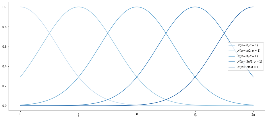
Note that we omit the $\frac{1}{\sigma\sqrt{2\pi}}$ from the PDF of the normal distribution because this just changes the magnitude of the result–but we do that anyway with the coefficients of the OLS model. The reshape method is used to make sure the negation of $x$ and $\mu$ broadcasts correctly.
res = sm.OLS(y_data, Xn).fit()
res.summary()
| Dep. Variable: | y | R-squared (uncentered): | 0.906 |
|---|---|---|---|
| Model: | OLS | Adj. R-squared (uncentered): | 0.888 |
| Method: | Least Squares | F-statistic: | 48.35 |
| Date: | Thu, 17 Mar 2022 | Prob (F-statistic): | 4.70e-12 |
| Time: | 12:25:27 | Log-Likelihood: | -0.84827 |
| No. Observations: | 30 | AIC: | 11.70 |
| Df Residuals: | 25 | BIC: | 18.70 |
| Df Model: | 5 | ||
| Covariance Type: | nonrobust |
| coef | std err | t | P>|t| | [0.025 | 0.975] | |
|---|---|---|---|---|---|---|
| x1 | 0.1844 | 0.187 | 0.988 | 0.333 | -0.200 | 0.569 |
| x2 | 0.9804 | 0.177 | 5.538 | 0.000 | 0.616 | 1.345 |
| x3 | 0.2501 | 0.172 | 1.454 | 0.159 | -0.104 | 0.605 |
| x4 | -1.3673 | 0.177 | -7.724 | 0.000 | -1.732 | -1.003 |
| x5 | 0.5629 | 0.187 | 3.016 | 0.006 | 0.178 | 0.947 |
| Omnibus: | 0.010 | Durbin-Watson: | 2.353 |
|---|---|---|---|
| Prob(Omnibus): | 0.995 | Jarque-Bera (JB): | 0.166 |
| Skew: | 0.034 | Prob(JB): | 0.920 |
| Kurtosis: | 2.642 | Cond. No. | 4.49 |
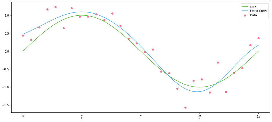
And plot the data along with the fitted curve:
with plot_sine() as ax:
    ax.scatter(x_data, y_data, color=scatter_colour, label="Data")
    ax.plot(x_points, np.sin(x_points), label="$\sin{x}$")
    ax.plot(x_points, Xn_points @ res.params, label="Fitted Curve")
Actual Data
Up to this point we have cheated somewhat by using $x$ data that is particularly helpful: 100 ordered and evenly-spaced values between $0$ and $2\pi$. By means of an example of real-world data, we use the Palmer Penguins, via its Python package data set:

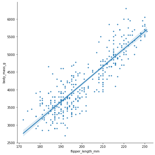
Let’s make a quick regression plot of the body mass in grams against flipper length in mm:
penguins = load_penguins()
sns.lmplot(
    data=penguins,
    x="flipper_length_mm",
    y="body_mass_g",
    height=7,
    palette="husl",
    scatter_kws=dict(s=10),
)
<seaborn.axisgrid.FacetGrid at 0x16c082550>
Let’s populate our $x$ and $y$ data in new variables so we can build a regression model:
x_penguins = penguins.dropna().flipper_length_mm.values
y_penguins = penguins.dropna().body_mass_g.values
Taking a look at the $x$ data, it’s certainly less helpful than we had before–it’s just a jumble of numbers!
x_penguins[:10]
array([181., 186., 195., 193., 190., 181., 195., 182., 191., 198.])
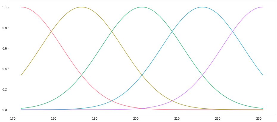
In this case, we have to construct our basis functions from the range of the $x$ data, instead of the data itself:
limits = (x_penguins.min(), x_penguins.max())
x_range = np.linspace(*limits, 100)
Xn = gaussian(x_penguins, np.linspace(*limits, 5), 10)
Because our data are unordered, it doesn’t make sense to plot them. But we can plot the Gaussian curves that we use based on the range of the $x$ data. Note that here we have provided a value of $\sigma$ to scale the width of the distributions:
Xr = gaussian(x_range, np.linspace(*limits, 5), 10)

fig, ax = plt.subplots()
basis_colors = sns.color_palette("husl", 5)
ax.set_prop_cycle(cycler(color=basis_colors))
_ = ax.plot(x_range, Xr)
res = sm.OLS(y_penguins, Xn).fit()
res.summary()
| Dep. Variable: | y | R-squared (uncentered): | 0.992 |
|---|---|---|---|
| Model: | OLS | Adj. R-squared (uncentered): | 0.992 |
| Method: | Least Squares | F-statistic: | 8426. |
| Date: | Thu, 17 Mar 2022 | Prob (F-statistic): | 0.00 |
| Time: | 12:25:28 | Log-Likelihood: | -2447.5 |
| No. Observations: | 333 | AIC: | 4905. |
| Df Residuals: | 328 | BIC: | 4924. |
| Df Model: | 5 | ||
| Covariance Type: | nonrobust |
| coef | std err | t | P>|t| | [0.025 | 0.975] | |
|---|---|---|---|---|---|---|
| x1 | 2440.7038 | 161.518 | 15.111 | 0.000 | 2122.963 | 2758.445 |
| x2 | 1818.8011 | 97.251 | 18.702 | 0.000 | 1627.486 | 2010.116 |
| x3 | 2523.4005 | 91.215 | 27.664 | 0.000 | 2343.960 | 2702.841 |
| x4 | 2656.9813 | 87.616 | 30.325 | 0.000 | 2484.620 | 2829.342 |
| x5 | 4440.3642 | 109.132 | 40.688 | 0.000 | 4225.677 | 4655.052 |
| Omnibus: | 8.388 | Durbin-Watson: | 2.341 |
|---|---|---|---|
| Prob(Omnibus): | 0.015 | Jarque-Bera (JB): | 8.472 |
| Skew: | 0.390 | Prob(JB): | 0.0145 |
| Kurtosis: | 3.054 | Cond. No. | 8.43 |
Let’s plot the result of our OLS fit on the Palmer penguins data, along with the values of the individual basis functions multiplied by their fitted parameters. This give us a clear picture of what’s happening:
fig, ax = plt.subplots(figsize=(9, 9))

colours = sns.color_palette("husl", 2)
basis_colors = sns.color_palette("Blues", 5)
ax.set_prop_cycle(cycler(color=basis_colors))

ax.scatter(x_penguins, y_penguins, s=10, color=colours[0], label="Data")
ax.plot(x_range, Xr @ res.params, color=colours[1], label="Fitted Curve")
ax.plot(x_range, Xr * res.params, label="Basis Functions")

handles, labels = ax.get_legend_handles_labels()

ax.legend(
    [handles[-1], handles[0], handles[3]],
    [labels[-1], labels[0], labels[3]],
)
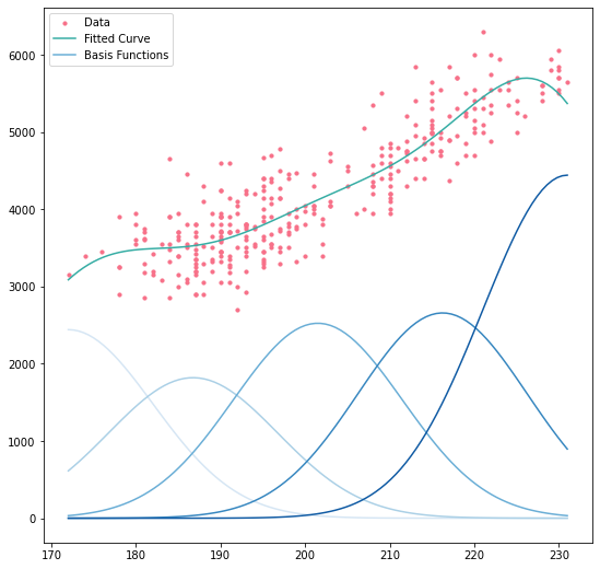
At any point, the expected value of the curve is just the sum of the basis functions’ values at that point–that’s just what an OLS regression is after all. Looking at the boundary of the $x$ data, in particular the upper bound, we see something that you have to be very careful with when performing basis expansions: deciding what to do with data points that lie outside the range of the training data. If, having built our model, we wanted to predict the weight of a penguin with a flipper length of 240mm, our model would almost certainly give an underestimate. As we’ll see later, better basis functions exist to limit the effects of this, but we must remain cognizant of its risks.
Piecewise Cubic Polynomials
Now that we have a good grasp on what a basis function is, and we’ve seen some (admittedly daft) basis functions fitted on real world data, we’ll take a look at one of the two most popular basis functions: piecewise cubic polynomials (basis splines, are the other).
A piecewise cubic polynomial is simply a function that is comprised of cubic polynomials defined on ranges of our $x$ data that are mutually exclusive and collectively exhaustive: they are in pieces. The points at which one cubic polynomial hands over to the next are called knots.
For this work, we’re going to use symfit, a Python package built on top of SymPy that allows us to define functions and fit data to them. We’ll start by defining our variables, the parameters, and the piecewise function itself. (There’s a bit of Python magic here, in particular using starmap, but the important part is that we end up with the defintion of a piecewise cubic polynomial with knots at $\frac{2\pi}{3}$ and $\frac{4\pi}{3}$.)
Define our variables, the powers we’ll need, and the polynomial parameters:
x, y = variables("x, y", domain=Reals)

powers = [3, 2, 1, 0]

poly_parameters = {
    i: parameters(
        ", ".join(
            f"a_{i}{j}"
            for j in range(3, -1, -1)
        )
    )
    for i in range(1, 4)
}

poly_parameters
{1: (a_13, a_12, a_11, a_10),
 2: (a_23, a_22, a_21, a_20),
 3: (a_33, a_32, a_31, a_30)}
Define our three polynomials from the parameters and $x$:
def raise_x(a, p):
    return a * x ** p

y1 = sum(starmap(raise_x, zip(poly_parameters[1], powers)))
y2 = sum(starmap(raise_x, zip(poly_parameters[2], powers)))
y3 = sum(starmap(raise_x, zip(poly_parameters[3], powers)))
Finally, define our knots and the piecewise function itself:
x0, x1 = 2 * np.pi / 3, 4 * np.pi / 3

piecewise = Piecewise(
    (y1, x < x0),
    (y2, ((x0 <= x) & (x < x1))),
    (y3, x >= x1),
)
Thus, our piecewise function, which we’ll call $f$ for brevity, is:
Next, a little more setup. We define a model (which is just our piecewise function), and then four sets of constraints, as follows:
- There are no constraints on $f$
- $f$ is continuous at the knots
- $\frac{df}{dx}$ is continuous at the knots
- $\frac{d^2f}{dx^2}$ is continuous at the knots
model = Model({y: piecewise})
f_continuous_at_knots = [
    Eq(y1.subs({x: x0}), y2.subs({x: x0})),
    Eq(y2.subs({x: x1}), y3.subs({x: x1})),
]

f_prime_continuous_at_knots = [
    Eq(y1.diff(x).subs({x: x0}), y2.diff(x).subs({x: x0})),
    Eq(y2.diff(x).subs({x: x1}), y3.diff(x).subs({x: x1})),
]

f_prime_prime_continuous_at_knots = [
    Eq(y1.diff(x, 2).subs({x: x0}), y2.diff(x, 2).subs({x: x0})),
    Eq(y2.diff(x, 2).subs({x: x1}), y3.diff(x, 2).subs({x: x1})),
]


constraints = {
    "Discontinuous": [],
    "Continuous": f_continuous_at_knots,
    "Continuous First Derivative": [
        *f_continuous_at_knots,
        *f_prime_continuous_at_knots,
    ],
    "Continuous Second Derivative": [
        *f_continuous_at_knots,
        *f_prime_continuous_at_knots,
        *f_prime_prime_continuous_at_knots,
    ],
}
Finally we can fit our function subject to the four sets of constraints:
params = {
    name: Fit(model, x=x_data, y=y_data, constraints=cons).execute().params
    for name, cons in constraints.items()
}
Now, we can plot the four different models against our data. The variables we’re defining here are just for the purposes of plotting, you don’t have to dwell on them:
x_small_range = np.linspace(x_data.min(), x0, 100)
x_mid_range = np.linspace(x0 + 0.000001, x1 - 0.0000001, 100)
x_large_range = np.linspace(x1 + 0.000001, x_data.max(), 100)
ix_small = x_data <= x0
ix_mid = (x0 < x_data) & (x_data <= x1)
ix_large = x1 < x_data

x_data_small = x_data[ix_small]
x_data_mid = x_data[ix_mid]
x_data_large = x_data[ix_large]

y_data_small = y_data[ix_small]
y_data_mid = y_data[ix_mid]
y_data_large = y_data[ix_large]
# Construct our figure and (2 x 2) axes, and set up colours
fig, axes = plt.subplots(nrows=2, ncols=2, sharex=True, sharey=True, figsize=(12, 9), dpi=90)
colours = sns.color_palette("husl", 3)

# Loop over the name, coefficent pairs zipped with the axes, and add `enumerate`
# for doing axes-specific things
for i, ((name, coeffs), main_ax) in enumerate(zip(params.items(), axes.flat)):

    # Create an inset axes focused on the first knot
    inset_ax = main_ax.inset_axes([0.05, 0.1, 0.35, 0.45])
    inset_ax.set_xlim(np.pi / 2, 5 * np.pi / 6)
    inset_ax.set_ylim(0.5, 1.2)
    inset_ax.set_xticklabels("")
    inset_ax.set_yticklabels("")
    main_ax.indicate_inset_zoom(inset_ax)

    # Plot the values on the main an inset axes
    for ax in (main_ax, inset_ax):
        for x_range, xd, yd, colour in (
            (x_small_range, x_data_small, y_data_small, colours[0]),
            (x_mid_range, x_data_mid, y_data_mid, colours[1]),
            (x_large_range, x_data_large, y_data_large, colours[2]),
        ):
            ax.plot(x_range, model(x=x_range, **coeffs).y, color=colour)
            ax.scatter(xd, yd, s=10, color=colour)
            ax.axvspan(x_range.min(), x_range.max(), alpha=0.05, color=colour, zorder=-10)
            ax.plot(x_points, np.sin(x_points), color="grey", alpha=0.2, lw=1)

    # Format the axes
    if i > 1:
        main_ax.set_xlabel("x")
        main_ax.set_xticks(np.linspace(0, 2 * np.pi, 5))
        main_ax.set_xticklabels([0, "$\pi/2$", "$\pi$", "$3\pi/2$", "$2\pi$"])
    if not i % 2:
        main_ax.set_ylabel("y")

    main_ax.set_xlim(0, 2 * np.pi)
    main_ax.set_title(name)

    inset_ax.set_xticks([])
    inset_ax.set_yticks([])

fig.suptitle("Piecewise Cubic Polynomials", y=0.99, size=14)
fig.tight_layout()
fig.set_facecolor("white")
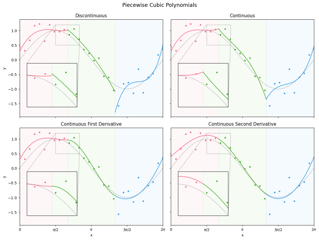
These four plots clearly demonstrate the value of the continuity constraints; the final plot, with continuous second derivatives, shows what we call a cubic spline. As it turns out (thanks to linear alegbra), we can define six functions in $x$ that form a basis of a cubic spline with two knots, as follows:
\[\begin{align} f_1 &= 1 & f_2 &= x & f_3 &= x^2 \\ f_4 &= x^3 & f_5 &= (x - \epsilon_1)^3 & f_6 &= (x - \epsilon_2)^3, \end{align}\]where $\epsilon_1$ and $\epsilon_2$ are our knots; $\frac{2\pi}{3}$ and $\frac{4\pi}{3}$. (Proving this set of equations meets our constraints is Exercise 5.1 in The Elements of Statistical Learning.)
Basis Splines
A basis spline, or B-spline, is a spline function that has minimal support with respect to a given degree, smoothness, and domain partition. In simpler terms, a B-spline is a piecewise polynomial which is non-zero for the fewest number of input ($x$) values of all the functions with the same polynomial degree, continuity when differentiated, and the knots that define it. Apologies if those terms aren’t that much simpler; I tried.
For a basis spline of order $M$, the $i$th $B$-spline basis function of order $m$ for the knot-sequence $\tau$, $m \leq M$ is denoted by $B_{i, m}(x)$. It is recusively defined, as follows:
\[B_{i, 1}(x) = \begin{cases} 1 & \text{if } \tau_i \le x < \tau_{i+1}, \\ 0 & \text{otherwise,} \end{cases}\]and
\(B_{i, m}(x) = \frac{x - \tau_i}{\tau_{i+m-1} - \tau_i} B_{i, m-1}(x) + \frac{\tau_{i+m} - x}{\tau_{i+m} - \tau_{i+1}} B_{i+1, m-1}(x)\) for $1, \ldots, K + 2M - m$.
If you’re particularly on the ball today, you might have noticed a slight problem with this recursive definition: as we drop down an order, we might end up looking for a knot that doesn’t exist. For this reason, our knot-sequence $\tau$ is actually augmented by boundary knots, to ensure the sums always work. It’s common to repeat the first and last knots as many times as required to make the function work, but this can lead to problems as we’ll see below. In the SplineTransformer class, they continue the knot sequence in both directions using the gaps between the first and last two original knots, as recommended in Flexible smoothing with B-splines and penalties. Another problem is that repeated knots cause the denominators explode; in these instances we take the multiplier to be zero.
Finally, it’s worth pointing out is that the order of a basis spline is one more than the degree of the piecewise polynomials of which it is made up. So the the canonical fourth order basis spline is a piecewise cubic polynomial.
Let’s now define our basis spline function. This will be the same as above, except that as we’re using NumPy, so we do some things to work with all $x$, $\tau$ and $i$ values at the same time.
def bspline(x, knots, i, order: int = 4):
    if order == 1:
        return ((knots[i] <= x.reshape(-1, 1)) & (x.reshape(-1, 1) < knots[i + 1])).astype(int)

    # Filter out the warnings about division by zero: we replace
    # these anyway with `np.where`
    with warnings.catch_warnings():
        warnings.simplefilter("ignore", RuntimeWarning)
        z_0 = np.where(
            np.isclose(knots[i + order - 1], knots[i]),
            0,
            (x.reshape(-1, 1) - knots[i]) / (knots[i + order - 1] - knots[i])
        )

        z_1 = np.where(
            np.isclose(knots[i + order], knots[i + 1]),
            0,
            (knots[i + order] - x.reshape(-1, 1)) / (knots[i + order] - knots[i + 1])
        )

    f_0 = bspline(x, knots, i, order - 1)
    f_1 = bspline(x, knots, i + 1, order - 1)

    return (z_0 * f_0) + (z_1 * f_1)
Now, let’s plot basis splines for order $\leq 4$, but using two different approaches to boundary knots:
- Repeating the boundary knots, as The Elements of Statistical Learning does
- Adding knots the same distance apart as that between the first and last two elements, as scikit-learn does
degree = 3
base_knots = np.linspace(0, 1, 11)
dist_min = base_knots[1] - base_knots[0]
dist_max = base_knots[-1] - base_knots[-2]
repeated_knots = np.r_[np.zeros(3), base_knots, np.ones(3)]
scikit_knots = np.r_[
    np.linspace(
        base_knots[0] - degree * dist_min,
        base_knots[0] - dist_min,
        num=degree,
    ),
    base_knots,
    np.linspace(
        base_knots[-1] + dist_max,
        base_knots[-1] + degree * dist_max,
        num=degree,
    ),
]
x_unit = np.linspace(0, 1, 1000)[:-1]

f1 = partial(bspline, x_unit, repeated_knots, np.arange(0, 13))
f2 = partial(bspline, x_unit, scikit_knots, np.arange(0, 13))

fig, axes = plt.subplots(nrows=4, ncols=2, figsize=(20, 16), sharex=True)

for order, row in enumerate(axes, start=1):
    for ax, f in zip(row, (f1, f2)):
        colours = sns.color_palette("husl", 13)
        ax.set_prop_cycle(cycler(color=colours))
        ax.plot(x_unit, f(order))
        ax.set_title(f"B-splines of Order {order}")
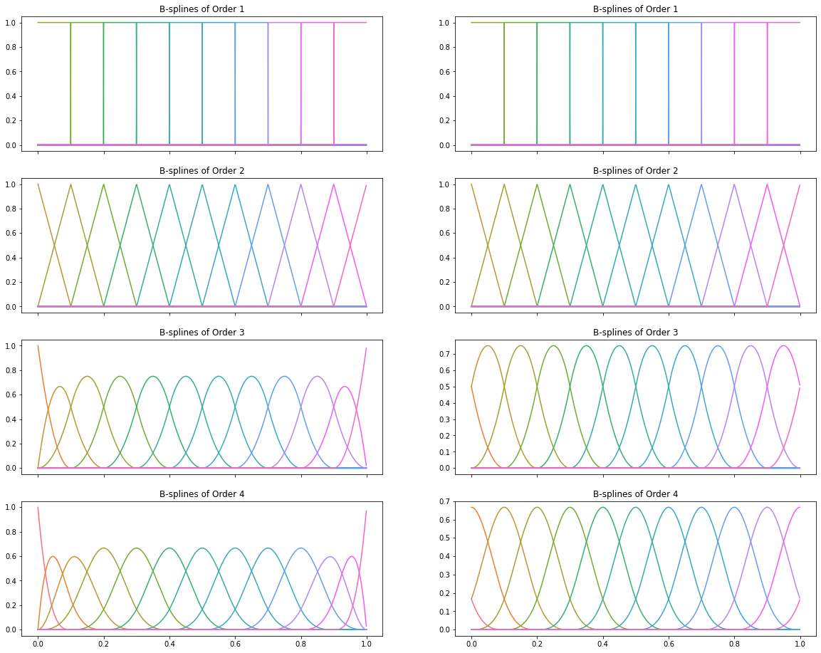
The above plots neatly demostrate why boundary knots are important: if we fit our regression models with training data that doesn’t span the range of possible $x$ values (say in the real world, we might see $x = 1.05$), repeating boundary knots means our estimates will be zero!
Basis Splines in Python
While SplineTransformer is new in scikit-learn 1.0, basis splines have been around in Python for a long time. They’re already in scipy, patsy, statsmodels, and most interestingly, pyGAM. pyGAM is the most interesting because it implements penalized basis splines; splines that impose a penalty on their second derivative to minimize overfitting. The biggest problem with splines is knot selection, which relates directly to the bias-variance trade-off: too few knots and we don’t capture the variability in our data; too many, and we overfit. The standard (non-penalized) approach to this is to set your knots either evenly-spaced in the range of your $x$ data, or based on the quantiles of your $x$ data, and then to choose as few knots as you can get away with. Penalization allows us to increase the number of knots dramatically without risking overfitting, but in the end we still have to set the multiplier of the penalty term to something sensible. More knots means slower fitting, particularly as a penalty term means you no-longer have a closed form solution of $\hat{\beta}$ and have to use (Penalized) Iteratively-Reweighted Least Squares. Nevertheless, pyGAM had the friendliest interface for fitting generalized additive models in Python (the name for linear models that use splines), and sadly it appears to be abandonware at this point (I’m seriously considering picking it up, but working at a startup and having two young children doesn’t lend itself to having masses of spare time!).
Further Reading
Most of the content in this post is discussed in Chapter 5 (Basis Expansions and Regularization) of The Elements of Statistical Learning, which absolutely anyone with an interest in data science should own. Its younger sibling, An Introduction to Statistical Learning is itself terrific, and Chapter 7 (Moving Beyond Linearity) of that book covers basis expansions, though B-splines only get a brief metion in the last section of the chapter. Simon N. Wood’s Generalized Additive Models is the last word on all things splines, and Simon is the author of the mgcv R package, but I’d probably from ESL first. Finally, Chapter 4 (Geogentric Models) of Richard McElreath’s Statistical Rethinking includes discussion of basis splines and GAMs, and it even has a GAM on the cover! Besides which, Statistical Rethinking is as masterful an introduction of Bayesian thinking as I could imagine, and I recommend it wholeheartedly.